American Tire Distributor
Freight Recovery Dashboard
CLIENT BACKGROUND
American Tire Distributors (ATD) is one of the largest tire distributors in America. They have several digital products that are used by their customers to sell tires and manage their tire shops. They also have their own internal tools to help their business function smoothly.
OPPORTUNITY
Create a dashboard for ATD internal users to show the recovery rate for freight. Getting this dashboard to a better state meant saving money for the company by allowing problems to be found and solved quickly within our supply chain team.
Roles
Lead UX Designer: Lauren Klintworth
UX Designer: Ashleigh Gonzalez
Main Stakeholder: Alejo Galindo
SKILLS

Project Kickoff
Discovery Business Stakeholder interviews
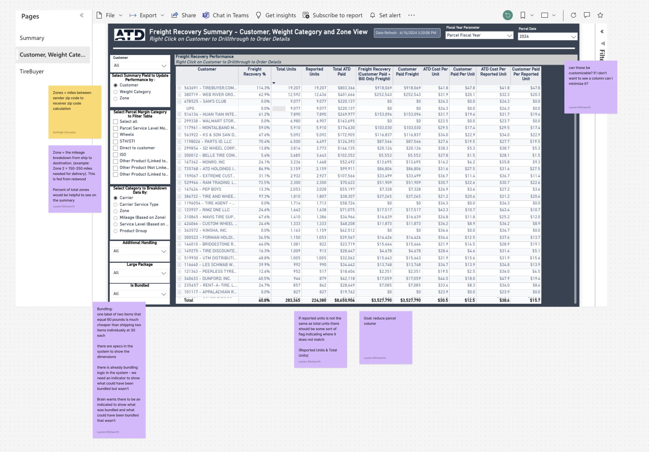
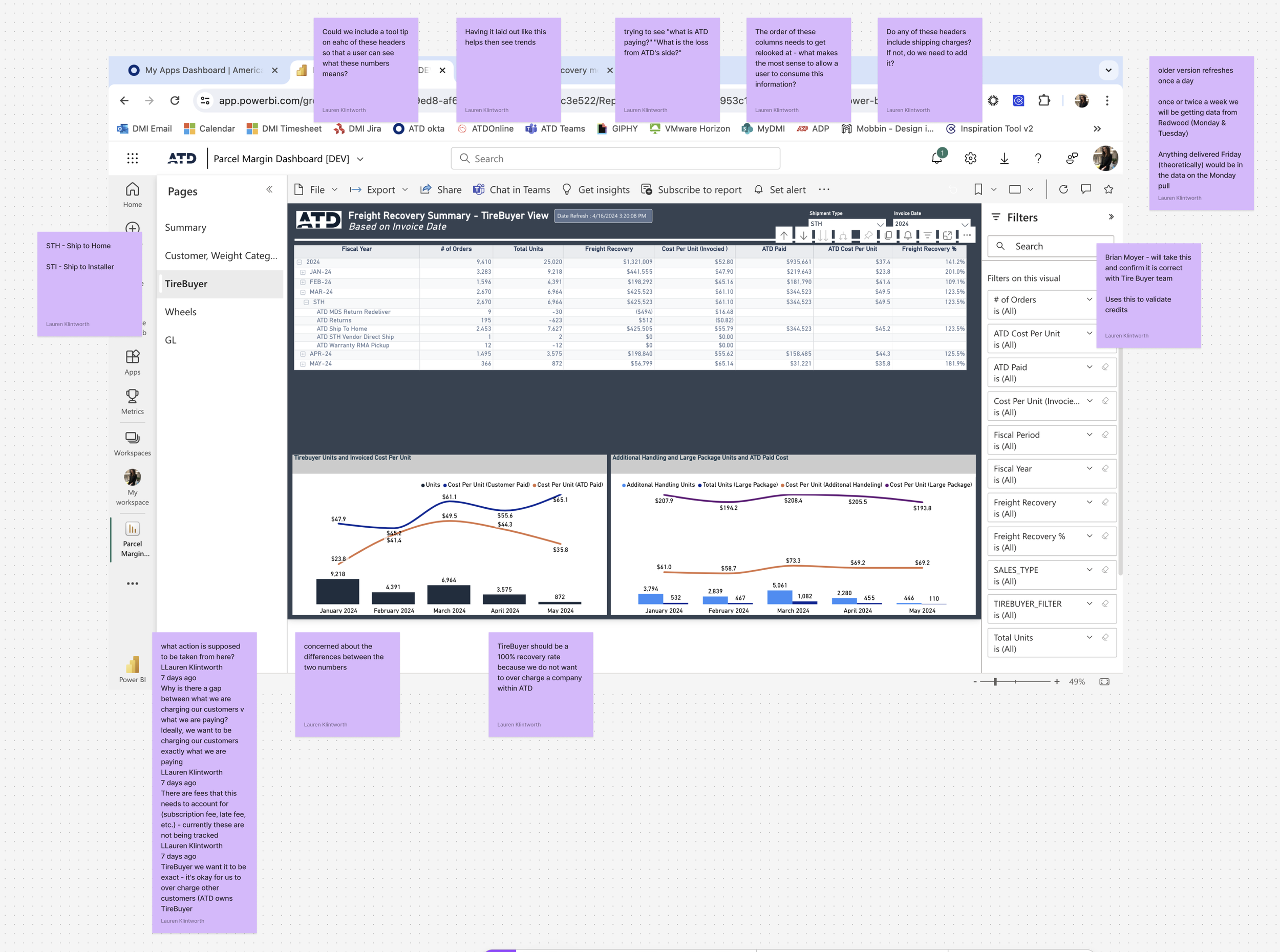
Collaborating closely with our primary stakeholder, we gained valuable insights into the purpose of the data and its key messages. These conversations helped us uncover pain points in the current design and identify the most critical data points for users interacting with the screen.
Pain Points:
No clear indication when data has a positive or negative effect to the company.
Current display of data does not allow for quick, easy understanding.
Too much granular details on a summary page
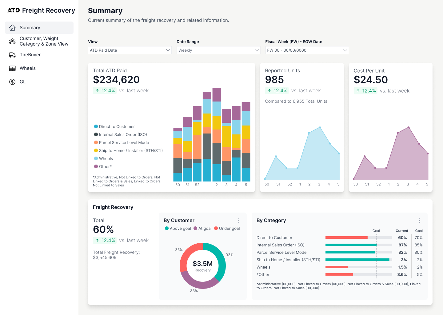
Top 3 important data points:
Report Units
Total ATD Paid
ATD Cost per Unit


Design Iterations
OUR PROCESS
There were multiple iterations of stakeholder feedback to move our designs along to the right direction.

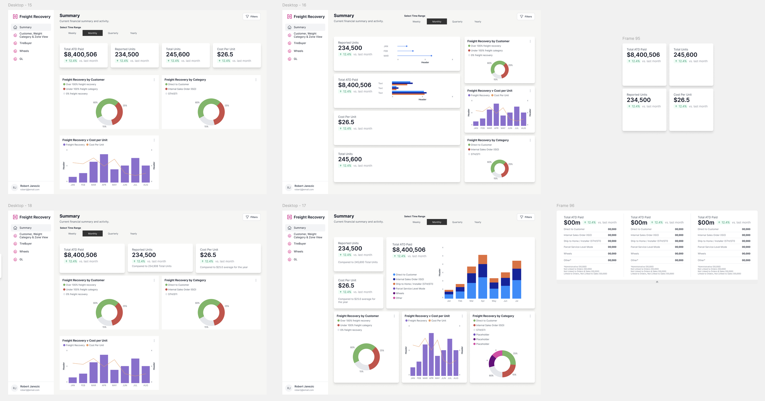


Final Designs
ENHANCED DATA UNDERSTANDING
Through a user-centered design process, we crafted a final solution that emphasized key data points while significantly improving clarity and accessibility. The redesigned layout enables users to quickly and confidently interpret the information presented. By streamlining data presentation, we also empowered users to easily identify potential issues and take informed actions efficiently.

-
![]()
Weekly View
-
![]()
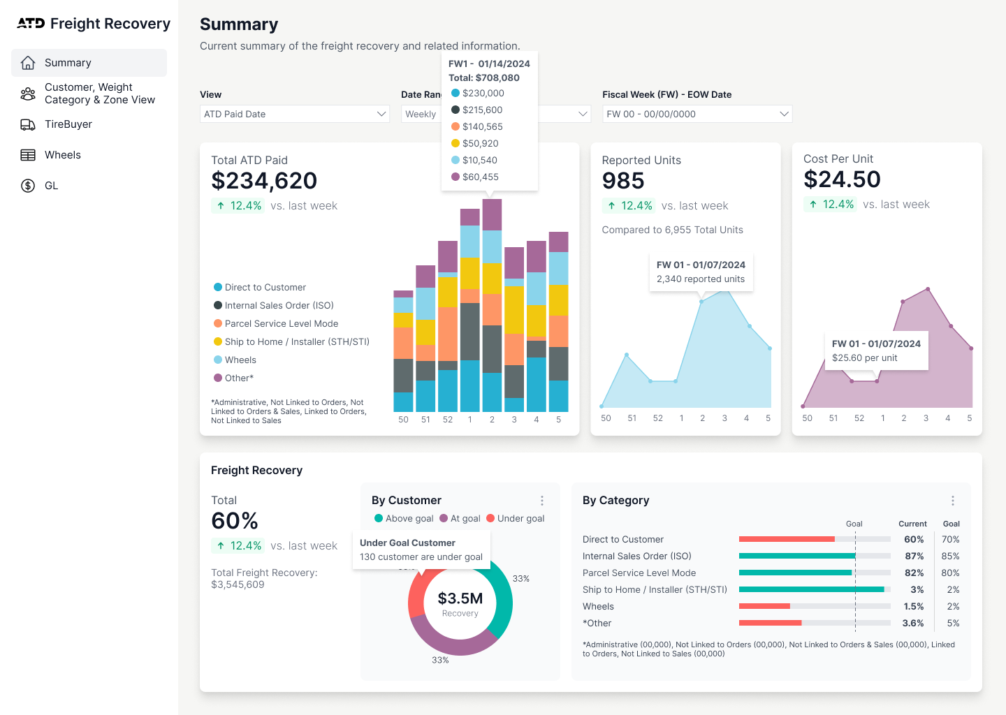
Weekly View - Popups
-
![]()
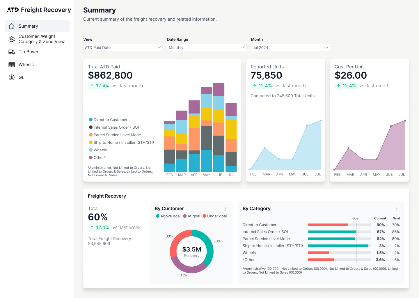
Monthly View
-
![]()
Quarterly View
-
![]()
Yearly View