AI Assistant Implementation:
Building a model without writing code
Provenir
BACKGROUND
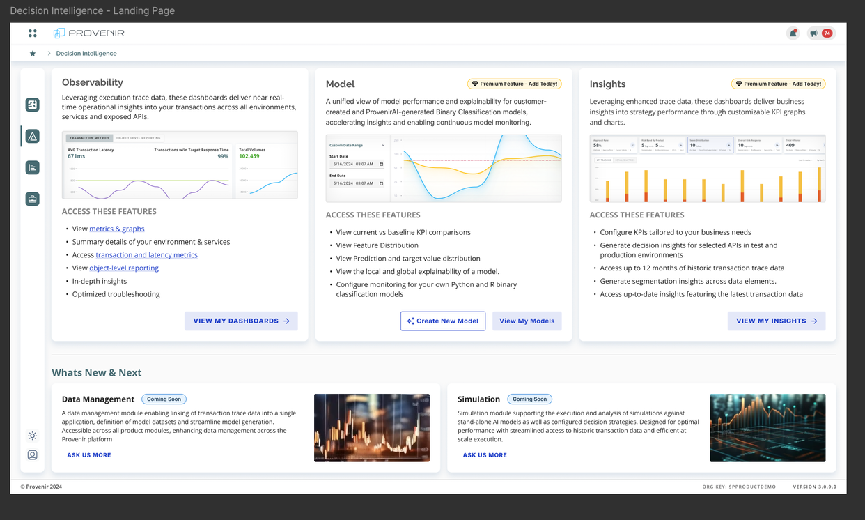
Provenir's Decision Intelligence module gives risk and fraud teams dashboards built on transaction trace data. Building a predictive model on top of that data meant writing Python or R — which put it out of reach for the analysts who understood the data best.
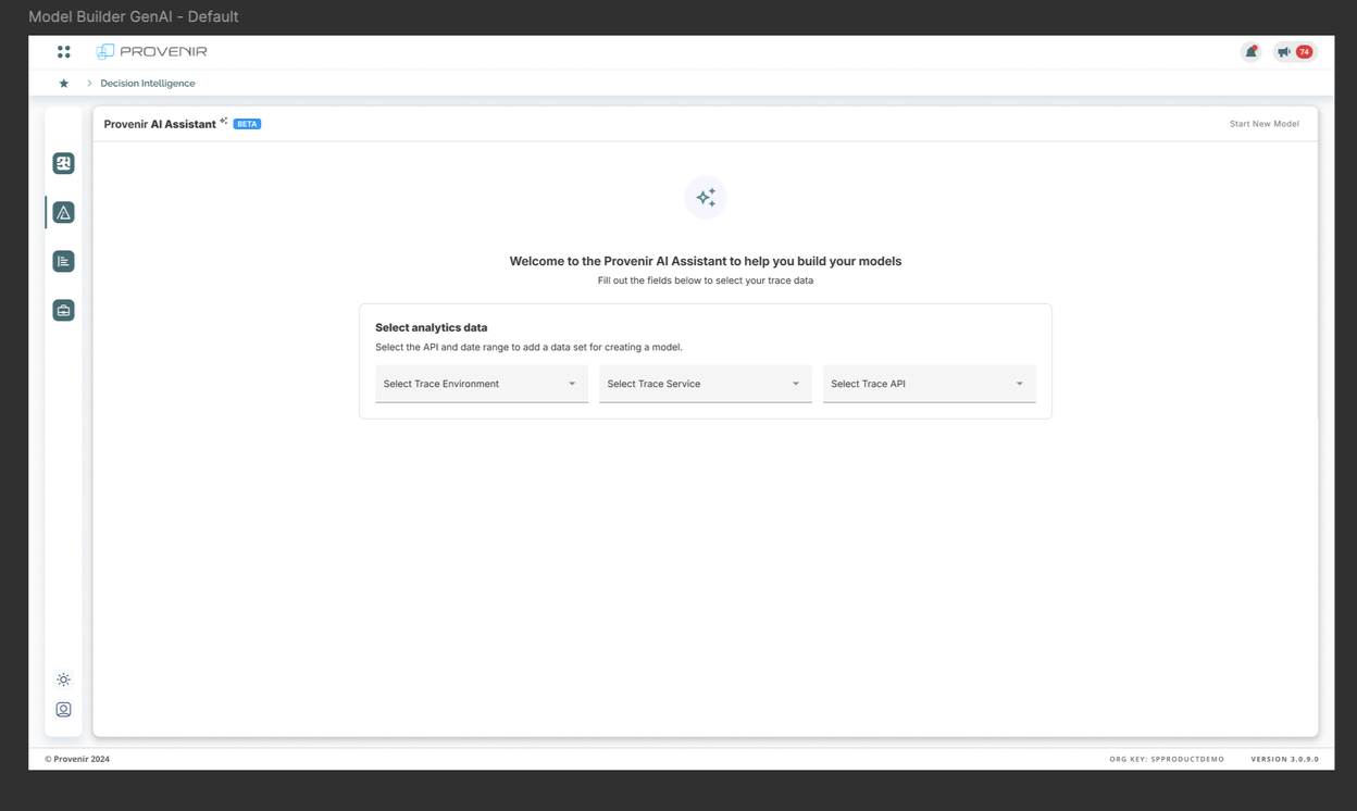
I led the design of the Provenir AI Assistant: a guided, conversational flow that takes a user from raw trace data to a trained, explainable model without code.
My Role
Lead designer. I owned the research, information architecture, user flows, interaction design, and UI across eleven design iterations. I worked alongside product, data science, and engineering, and partnered with a supporting designer on component and pattern work.
Team
Product, Design, Data Science, Engineering
The Problem
Analysts in Decision Intelligence could see what their models were doing. They could not build new ones.
Model creation required a data scientist, and the queue was long. Meanwhile the people closest to the data — the ones who could look at a transaction pattern and tell you what mattered — had no path from "I have a hypothesis" to "I have a model."
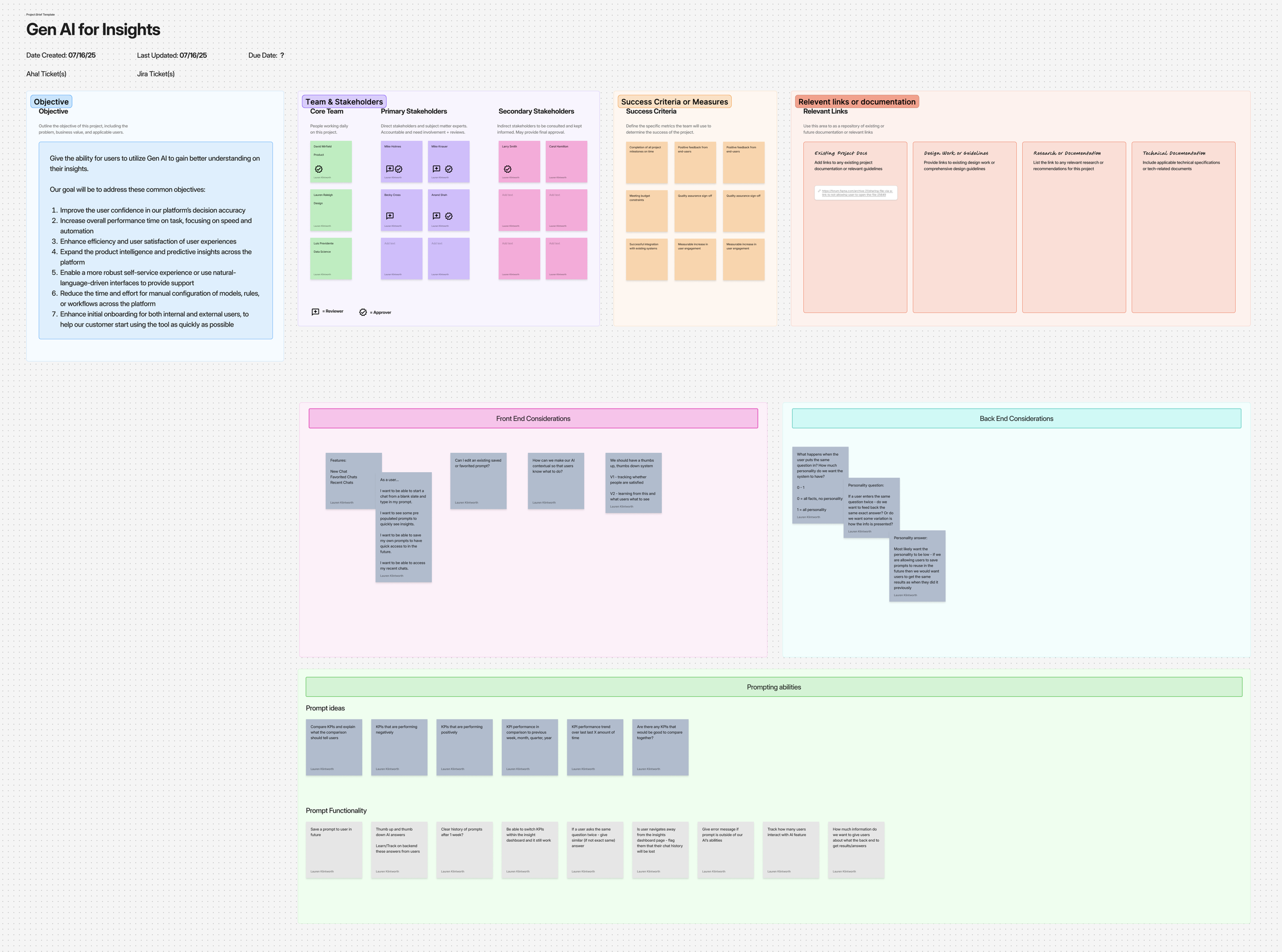
We scoped two objectives out of a longer list:
Increase confidence in the platform's decision accuracy. If users can't see why a model was chosen or how it reached a result, they won't act on it.
Enable self-service through natural language. Reduce the time and expertise needed to configure a model from days of specialist work to a single guided session.
Understanding the system before adding to it
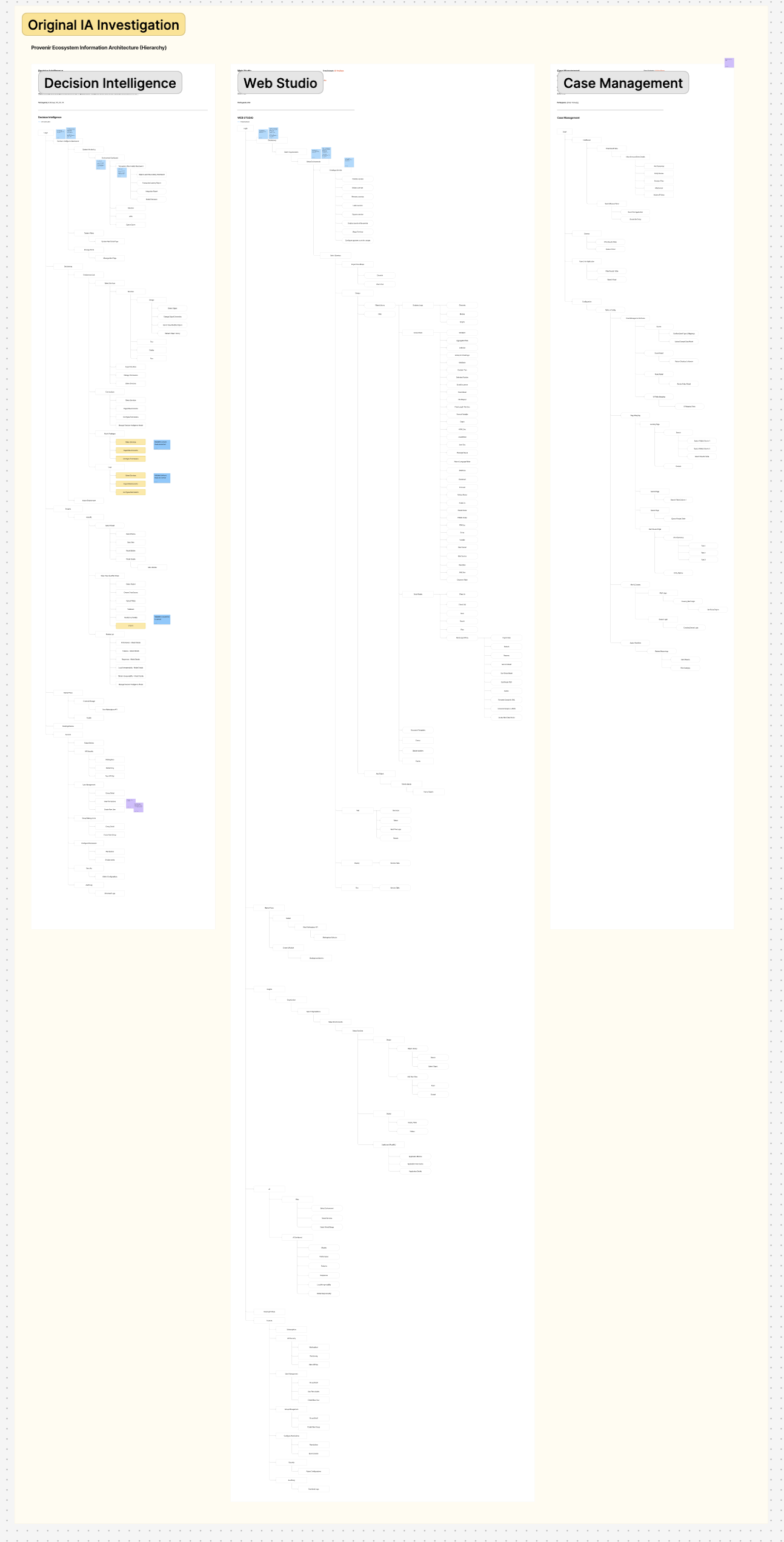
Before deciding what the AI should do, I mapped the existing information architecture of the Provenir ecosystem — every screen, every level of hierarchy across Decision Intelligence, Web Studio, and Case Management.
The point wasn't documentation. It was to find where a new capability could live without creating a second, parallel way of doing things. The map showed that model creation already had a home in Decision Intelligence; what it lacked was an entry point that didn't assume you could code.
That framed the work as extending an existing surface, not adding a new one.
Finding a pattern that fit
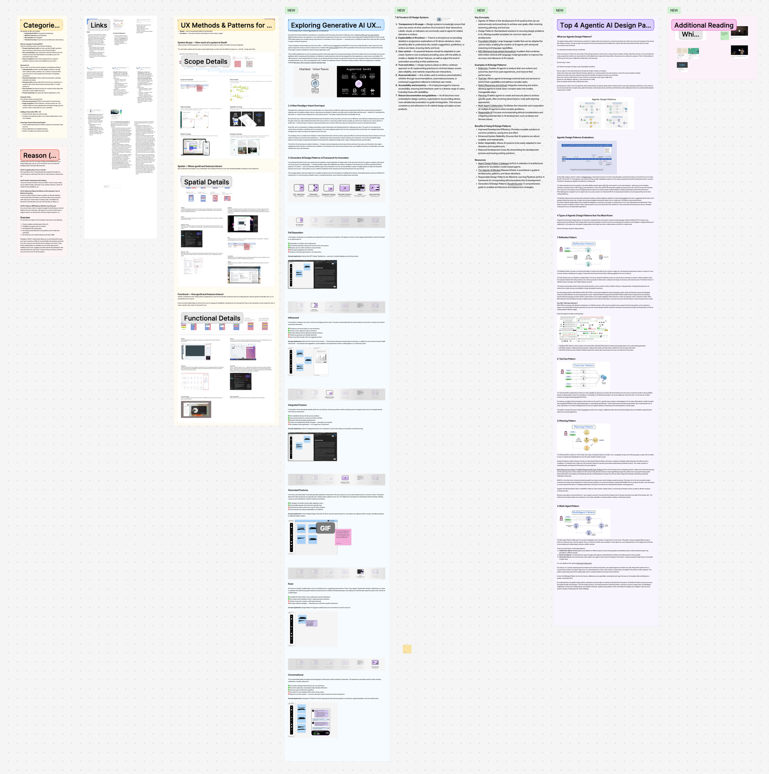
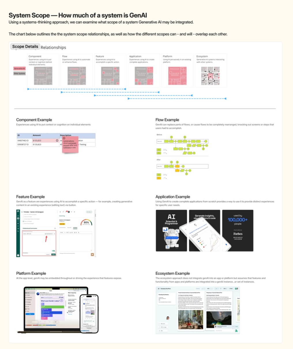
I looked at how other products were integrating generative AI, and used a scope-and-relationship framework to place our own work: is this a component, a flow, a feature, an application, or a platform-level capability?
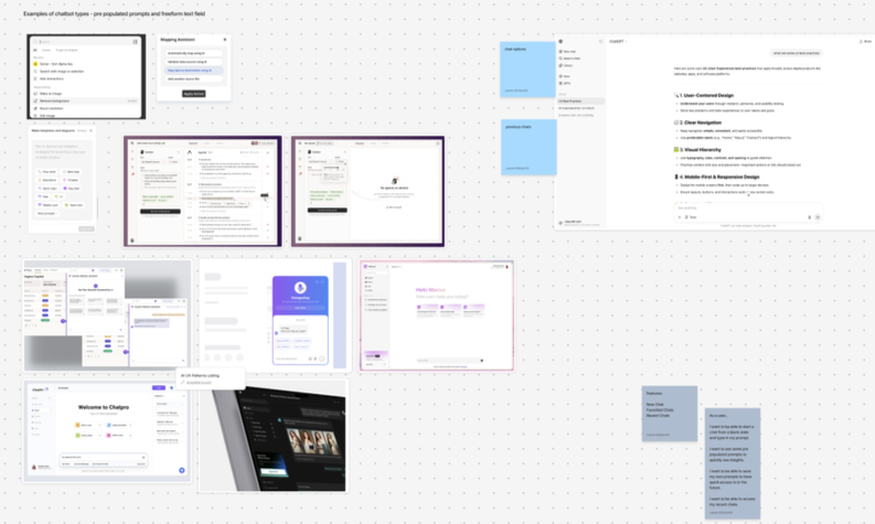
Nearly every precedent I found defaulted to the same answer — a chat panel bolted onto the side of an existing product. Open a drawer, type a question, get text back.
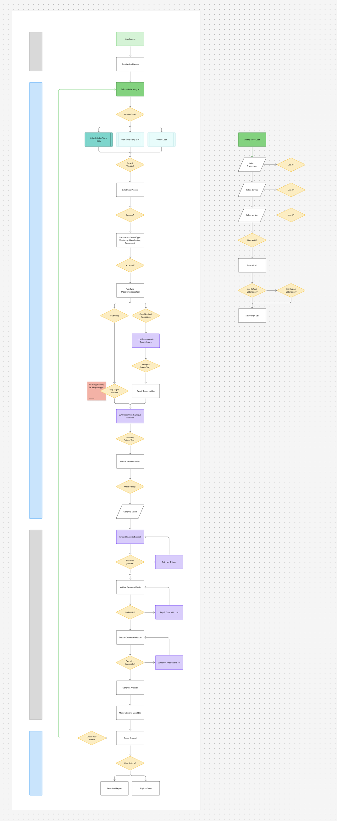
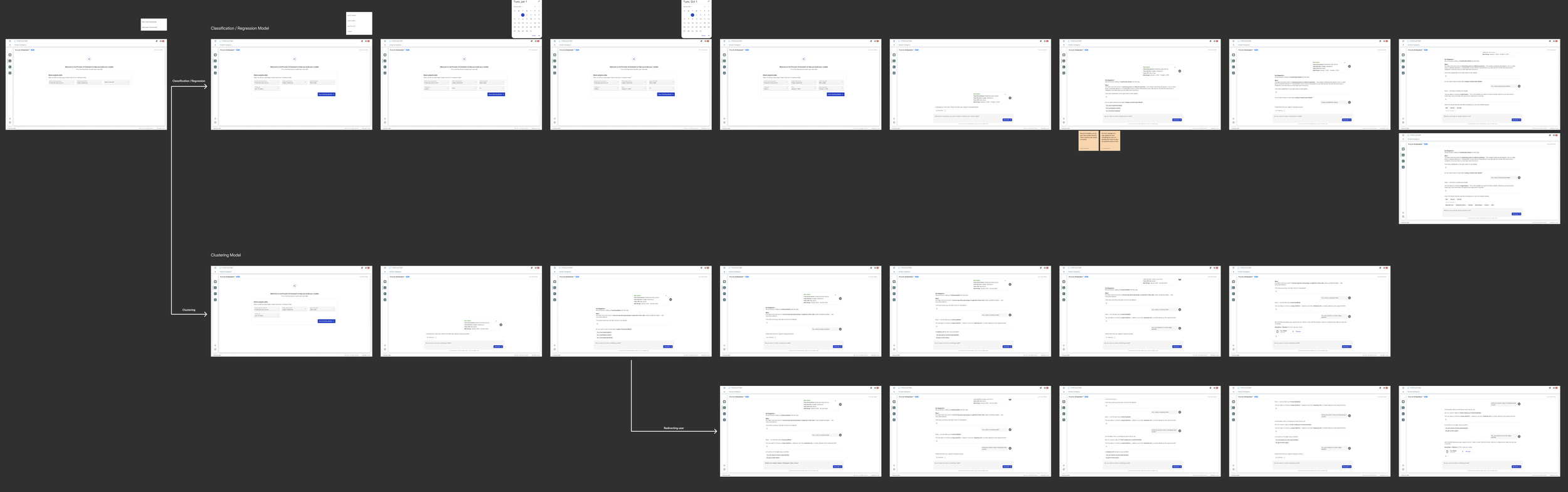
That pattern didn't fit our users. Model creation is a sequenced task with real dependencies: you need an environment before a service, a service before an API, a dataset before a model type, a model type before a target column. A blank chat box asks the user to already know that sequence.
The decision that came out of research: design this as an integrated feature that leads, not an open-ended assistant that waits.
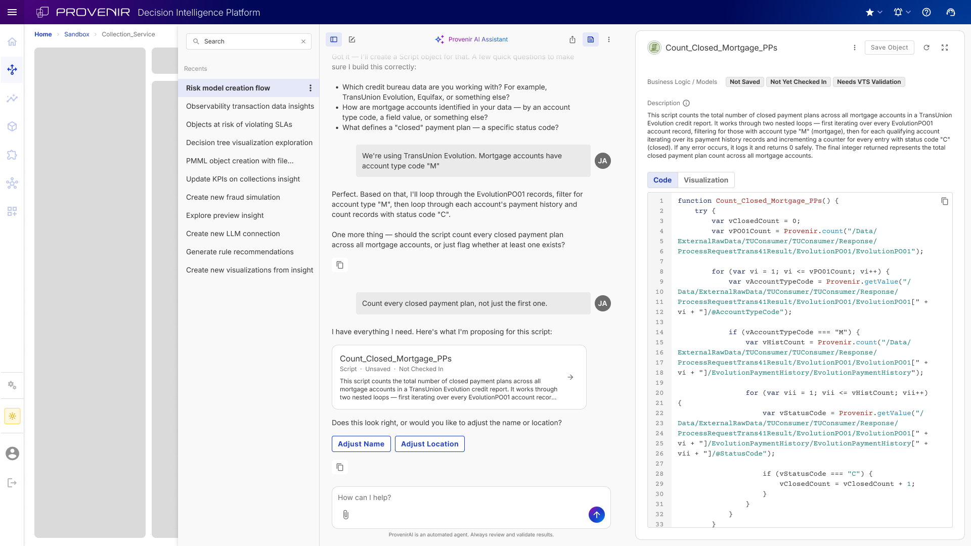
The AI proposes the next step, explains its reasoning, and asks for confirmation. Conversation is the interface; structure is underneath it.
Designing for a system that fails
This is the part of the project I'd point to first.
The assistant doesn't just phrase a response — it generates executable model code, runs it, and returns artifacts. Every one of those steps can fail, and fail differently each time. The same input does not guarantee the same output.
So the flow had to be designed around failure as a normal state, not an error state. Three recovery paths are built into the architecture:
• Generation fails → retry with a critique of the previous attempt
• Code is invalid → repair pass before anything executes
• Execution errors → error analysis and fix, then re-execute
The user-facing consequence: a retry is not an error message. It is a processing state. The user sees the system working, not the system breaking. Only exhausted recovery surfaces as a failure — and by then we know enough to say something specific about what went wrong.
Mapping this with engineering early also settled scope questions before they became rework.
One way in which we tried to minimize the failure states, was by including options for users to pick from in the form of buttons when we were able to. This helped to guide users down the right flow and decreased the likelihood of failure.
Two decisions
1. The AI recommends. The user confirms.
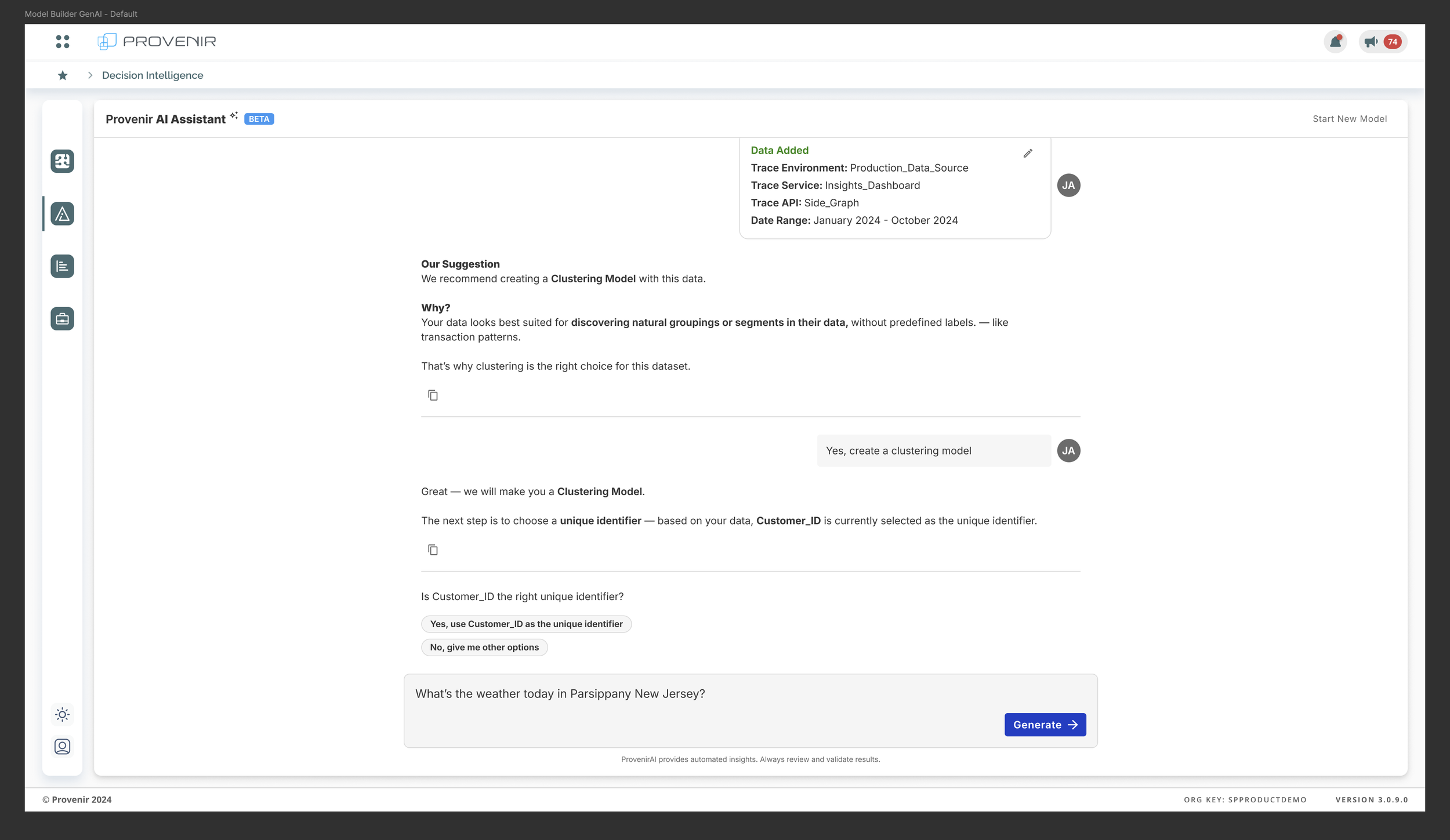
Every consequential step follows the same three-part structure: a recommendation, an explicit Why?, and a confirmation gate with a visible alternative.
When the assistant proposes a clustering model, it says what it is recommending, explains the reasoning in the user's terms — "your data looks best suited for discovering natural groupings or segments, without predefined labels" — and offers both "Yes" and "No, give me other options."
Two things this does is it keeps the user in the decision seat, which matters when the output feeds a risk decision, and it teaches a user who reads three or four of these explanations starts to understand model selection themselves.
The same pattern governs target column and unique identifier selection. The AI has an opinion. The user always has the last word.
2. Low personality, on purpose
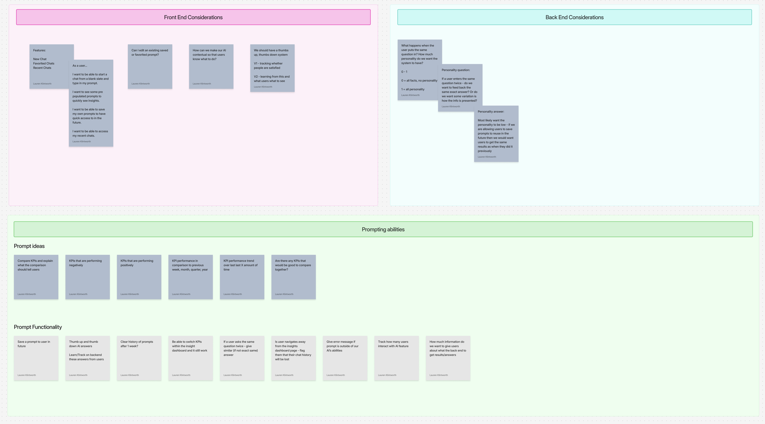
We debated how much personality the assistant should have on a 0–1 scale — 0 being all facts, 1 being fully conversational.
We landed near 0, and the reason came from a feature requirement rather than a tone preference: users can save prompts and reuse them. A saved prompt that returns a differently-worded answer each time isn't reusable — it's unreliable. If someone saves a prompt, runs it next quarter, and gets a response that reads differently, they can't tell whether the data changed or the model just phrased it another way.
Reproducibility beat warmth. In a platform where the output informs a credit or fraud decision, consistency is the trustworthy voice.
Guardrails and the unhappy path
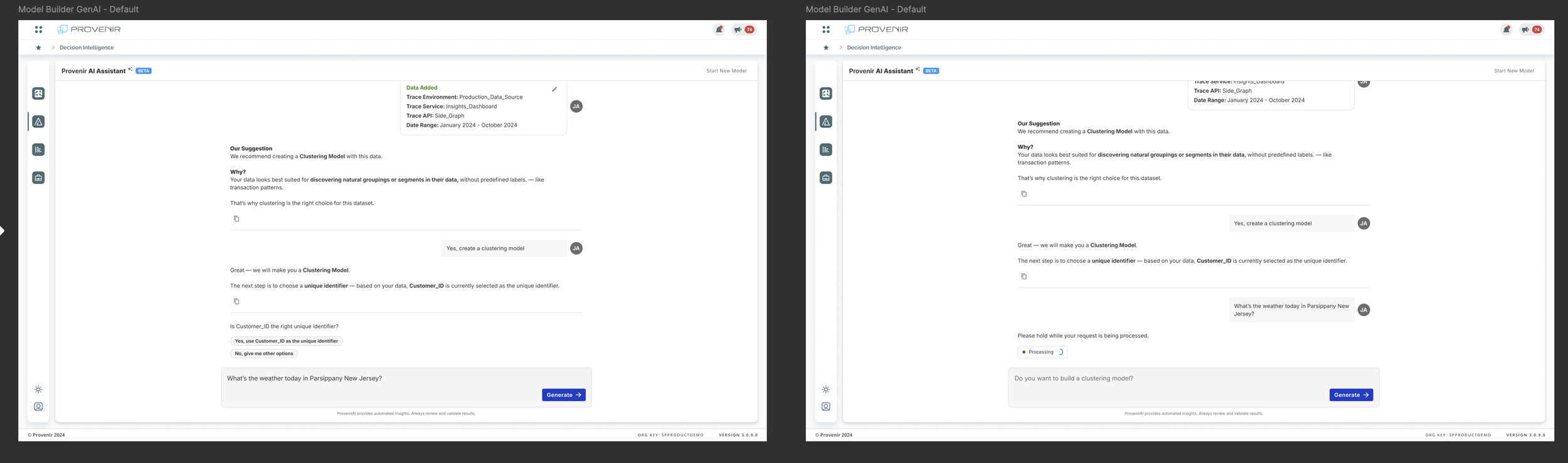
Conversational interfaces invite anything. A text field with a cursor doesn't communicate its own boundaries — so users test them, and a system that responds badly to a test loses trust it won't get back.
I designed for the cases where the user goes off the rails, or the system does:
Out of scope. When someone asks the assistant about the weather, it doesn't refuse and it doesn't hallucinate an answer. It acknowledges, processes, and redirects to the task in progress. No lecture about capabilities, no dead end.
Repeat questions. If a user asks the same thing twice, do they get an identical answer or a varied one? Tied directly to the personality decision: identical. Variation would undermine users’ confidence in the platform and the saved prompts.
Lost context. Navigating away from the insights dashboard mid-session drops chat history. Rather than silently losing the user's work, the design flags it before they leave.
Boundary awareness. Clear error messaging when a prompt falls outside what the assistant can do — specific about the limit, not a generic apology.
These were also the hardest to get sign-off on, because they're the states nobody demos. However, these were important points to be thought about when starting to introduce how our AI assistant would work within the platform. We needed users to have confidence in our AI’s capabilities when dealing with data, so we needed to think of all possible guardrails.
Eleven versions in four weeks
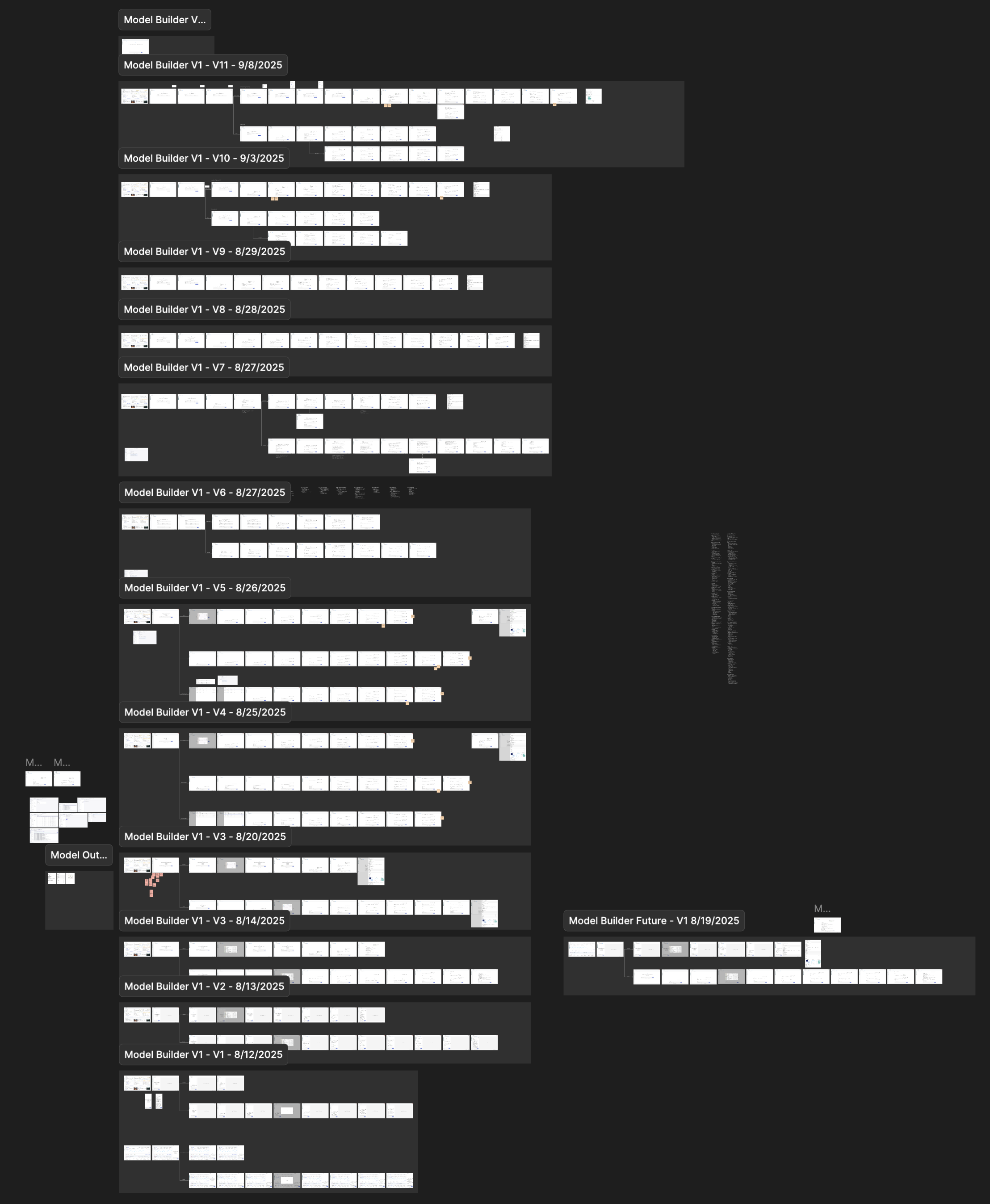
Between August 12 and September 8 the design went through eleven versions, reviewed with product, data science, and engineering throughout.
One thing I cut deliberately: target column selection for clustering models. It does not apply to the model type, and leaving it in the prototype would have made the flow look consistent at the cost of being correct.
Where it stands
The assistant shipped for version 1.
There's no usage data yet, so I'd rather say what we set out to measure than claim a result:
Time from data selection to a generated model, against the previous data-scientist-assisted baseline
Completion rate through the guided flow, and where users drop
Recommendation acceptance rate — how often users take the suggested model type versus asking for options. Consistently high acceptance could mean the recommendations are good, or that the confirmation gate has become a rubber stamp. Worth watching which.
Thumbs up/down ratio as the V1 satisfaction signal and the seed dataset for V2
What’s next
Extending the pattern beyond model building — the recommend / explain / confirm structure was designed to generalize to other configuration-heavy areas of the platform.
We are continuing to push the platform’s abilities with the AI assistant as well as bettering the look and feel of the chat through a new AI Assistant Design System. The new Design System aims to create consistent components usage and set ground rules for Provenir’s AI assistant.